

B2B SaaS Company Website Remodel
O V E R V I E W
About The Project
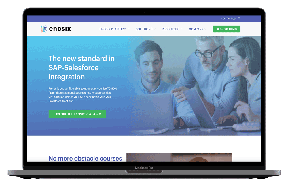
enosix is a B2B data integration tech company that connects back-end ERP systems like SAP with frontend CRM systems like Salesforce. The original website lacked concise/clear messaging, defined personas, and was centered around a thought leadership strategy. With a change in executive leadership, the entire business strategy changed. In turn, enosix needed a website that would support our new demand generation efforts and an ABX strategy.
Summary
Full enosix website remodel to increase brand recognition, optimize website performance, create an easy to use WordPress back-end builder, improve the clarity of messaging, and increase demand generation.
Team
VP of Marketing, Creative Director, Copywriter, Developer, Designer, SEO Specialist
Stake Holders
CEO, CSO + Founder, VP of Sales
Role
UI/UX Design - Information architecture, user personas, visual design, illustration, WordPress build, development handover
Duration
November 2021 - February 2022

“Thanks to the extensive persona and buyer journey work your team did in building this website, it’s one of the best I’ve ever reviewed.”
— Gartner Analyst
T H E C H A L L E N G E
Rebrand, redesign, restructure, and rewrite an entire website from scratch in order to increase demand generation and user engagement within one business quarter.
A P P R O A C H
Design Process

Discover
General Research
User Research
Competitive Analysis

Define
User Personas
User Stories

Ideate
Information Architecture
Mid-Fidelity Wireframes

Design
Rebrand
Style Guide
High-Fidelity Wireframes

Iterate
Launch
Review
Revise
D I S C O V E R
User Research
In order to get a better understanding of how we can help users on our website, we sent out a survey to existing customers. We wanted to determine what factors were influential on our website that lead to purchasing our integration software. We sent out a survey with these 5 questions:
What sort of information/resources can we include on our new website to help you?
When evaluating an integration partner what's most important/less important? Is there any must-have information you need to see?
How would you define a credible/trustworthy integration partner?
What are the most time-consuming or frustrating tasks in your day-to-day work?
How can we help? Whether it's our app or our website we want to make an impact on your success - let us know!
After analyzing our customers’ answers, we came to the conclusion that:
Customers want to see live screenshots of our product in action on our website
Social proof from case studies and trustworthy partners are important
They want to see more concise messaging and more emphasis on the value proposition
D I S C O V E R
Competitive Analysis

Pros
Screenshots of products in use
Technical diagrams
Video explainer videos
Modern branding and visual design
Concise messaging
Well organized IA
Starts with great value propositions and striking statistics on the home page
Video explainer in the hero to grab users’ attention
Testimonials and strong credibility
Cons
Crowded UI
Outdated
overwhelming
Inconsistent illustration styles
Accessibility issues
Levels of heading seem inconsistent and off-brand
Several images are blurry
D E F I N E
User Personas
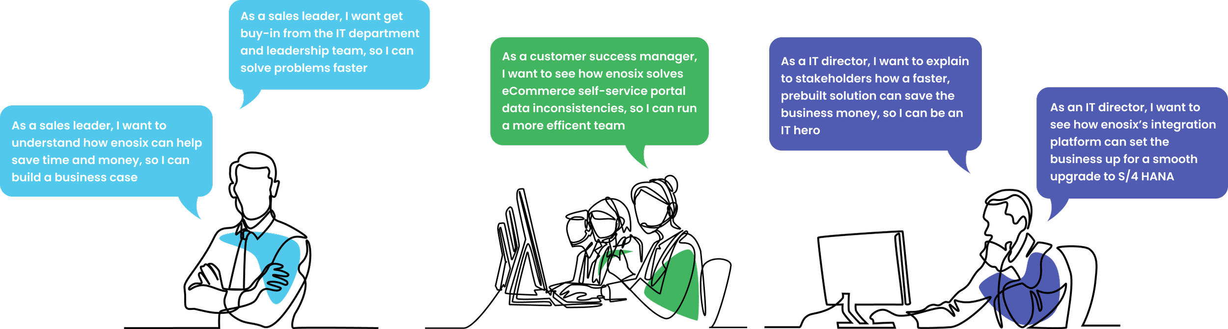
Led by the VP of Marketing, user personas with the highest propensity to buy were created. Each persona was then mapped to the buyer journey for that particular function.

Head of Sales
Goals:
Streamline quoting time
Cut inefficient business processes
Make his employees’ lives better
Frustrations:
Inaccurate data
Wasting time and money

Director of IT
Goals:
Strategize a smooth system integration
Address integration issues when migrating SAP S/4 HANA
Keep a secure system, avoid risks
Frustrations:
Unnecessary custom development that takes time away from more important business problems

Customer Service Manager
Goals:
Provide the best customer experience
Give customer service reps a 360-degree view of the customer
Faster call resolution
Frustrations:
Lack of margin control and visibility
Inaccurate quotes
D E F I N E
User Stories
D E F I N E
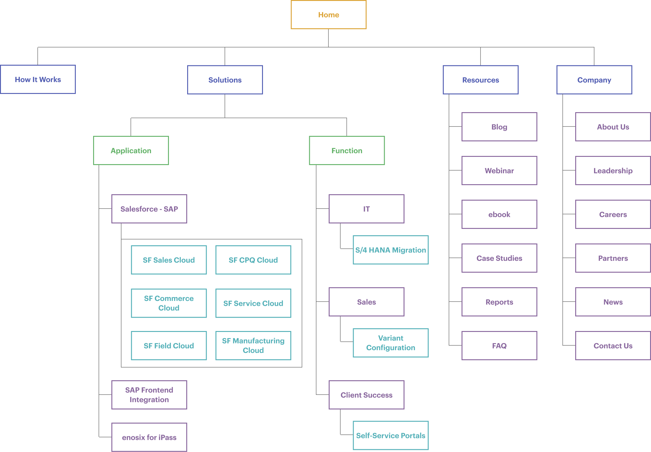
Information Architecture
A complete rework of the information architecture was performed to focus the enosix website on the buyer journey, new product structure, and account for future business expansions. The following structure provides easy to find, relevant information for our various audiences.
I D E A T E
Mid-Fidelity Wireframes
Goal: Increased lead generation through higher conversion rates, meet our audience where they’re at (user-centered), emphasize the business value we bring to our customers, and tell a better story.
With the following goals in mind, the team worked through several iterations of mid-fidelity wireframe designs to create an outline for each page. Below are a few select pages.


D E S I G N
Rebrand
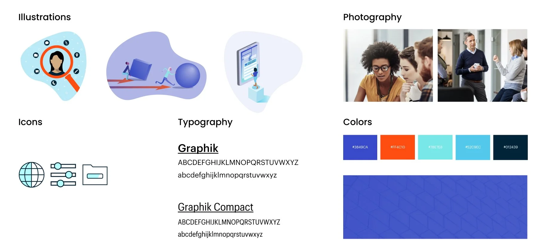
The team began our rebrand by researching our target market (30-50 year old men) and conducting branding exercises with leadership and customer-facing roles. What we discovered was that to be successful with our audience, we needed to establish a brand of trust, authenticity, and credibility. Evaluating the original brand, we concluded that our colors and branding were too harsh and flashy. In order to evoke the feelings of trust and authenticity, while adding more dimensionality to the brand, we toned down our color palette and added a secondary palette. In addition, we pivoted away from flat vector illustrations and embraced a continuous line art style. This element of the brand is very unique to the integration industry and helps to make us a recognizable brand.
Original Branding

Rebranding
D E S I G N
Style Guide
After the team defined our new branding, I worked with the creative director to put together a style guide for the new direction of our website remodel.


D E S I G N
Blocks
The enosix website was custom developed in WordPress. In order to create an easily maintainable, no code website back-end, our developer created “blocks” that allow our team to build custom pages on our own. After defining our page outlines, mid fidelity wireframes, and style guide the team realigned on the various blocks needed:
CTA zone
Resources
3 across icon with text cards
Leadership display
WYSIWYG
FAQ’s Accordion
Quotes
Image with content
Header
Logo bar
Forms
Related resources (built with a dynamic tagging system)
Case study slider
Simple content
Each block was created within a 12 column layout grid. In order to create a responsive website, each block has three variations for small, medium, and large breakpoints. Below are a few block examples.


D E S I G N
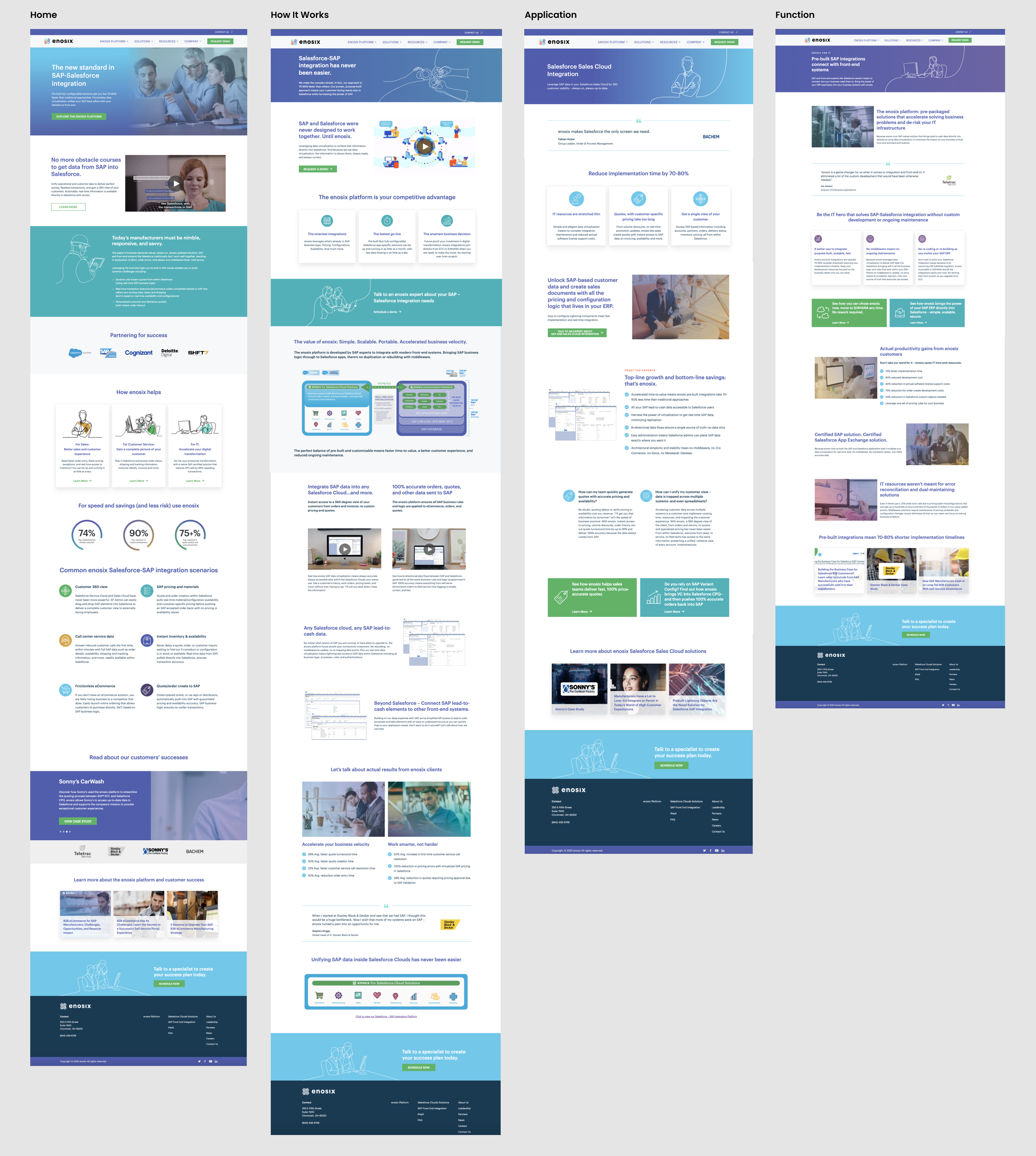
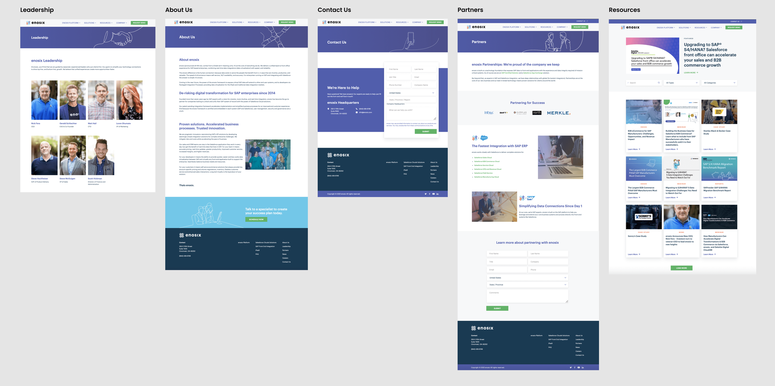
High-Fidelity Wireframes
After piecing all the blocks together and adding copy written by our copywriter and VP of marketing, our final website pages were built!
178 new pages were created.
Main website pages/ category templates
C O M P A R I S O N
Before & After

T E S T & R E V I E W
Iterate
After finalizing the website, the website team and internal employees tested the site for any usability issues. A few missing links were caught and a couple of loading/caching issues were taken care of by our developer. We then set up Hotjar’s heat-mapping tool and google analytics to give us insight into how our users are navigating the website.
A Gartner analysis was then asked to review our website and provide feedback. Overall, the analyst gave us incredibly positive feedback. There were a few minor critiques suggested such as:
More clear CTA’s on the how it works page to help let users know exactly what to expect when clicking buttons.
Consider adding more titles/headlines to introduce core content components and set expectations for page skimmers.
Make graphics that people are clicking lead to relevant pages - or provide text that states to click the graphic to navigate to x…
Add more alt text and check certain color contrast errors on “WAVE” to maximize accessibility on the website.
All suggestions were implemented to improve the user experience of the website
R E F L E C T I O N
Key Takeaways
This project allowed me to learn a lot about the website design process in a real-world setting. I learned how to handle challenges and realized that the design process is not always linear and or perfect. I was able to work one on work with our developer and better understand realistic design capabilities for website modules and best practices for responsive design. The awesome team I was a part of taught me how to solve complex business problems for applications by not only understanding/designing for the user but also keeping the business goals front and center. I also learned how to manage stakeholders’ expectations and that constant communication and realigning are the key to success. This project was a great learning experience. I feel so fortunate to have worked on an outstanding team.
P O S T L A U N C H
Next Steps
Now that the website has been launched, I will continue to monitor our analytical tools to make improvements to the user experience. I will look at key factors such as site traffic, user engagement, behavior flow, audience details, interests, and conversation rates.